Accessible career coaching service to help people who are blind
UX Design
This is the third and most challenging project for me that was created as part of the Google UX Design Professional Certification Program. The program includes the fundamentals of UX design, conduct user research, and design prototypes. I completed this project over the course of 1 month and continue to improve my knowledge and learn more about UX design with a focus on accessibility technology.
Overview
There is almost no affordable coaching service to help blind people in the form of an app or website. It has been identified that there are features that make it easier for blind people to use the app or website, but still not in a way that they can fully rely on the use. Too much content, text entry problems, navigation are just some of the problems.
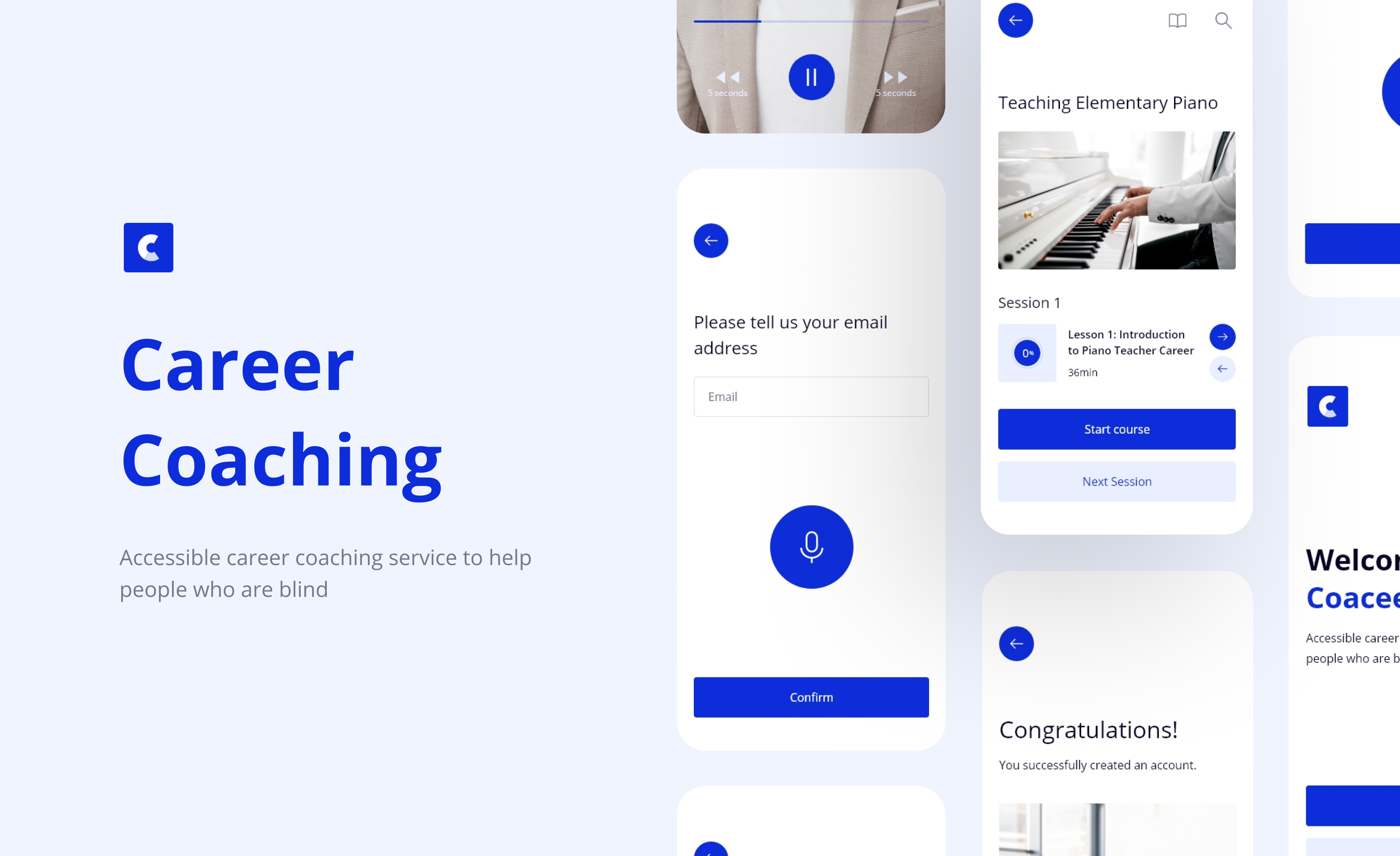
The Coaceer is an accessible career coaching service to help people who are blind. The Coaceer has the aim of making it easier for blind people to use the app and and thus contribute to the improvement of their career.
My role: UX designer designing an accessible career coaching service to help people who are blind.
The goal: Design an accessible career coaching app service to help people who are blind. App must have a screen reader, must be concise and with easy navigation, avoid unnecessary content so that they can easily move through the app.
Understanding the user
Empathize and understanding the users, define the problem statements, hypothesis statements, and value propositions is one of the major things. For this project the target audience is primary blind and visually impaired people but study include and people who do not have any visual impairment.
The key challenge is to determine the experience and needs of blind and visually impaired people during the use of apps and websites especially for education or career improvement. After that, designing the app in accordance with user needs to improve their experience.
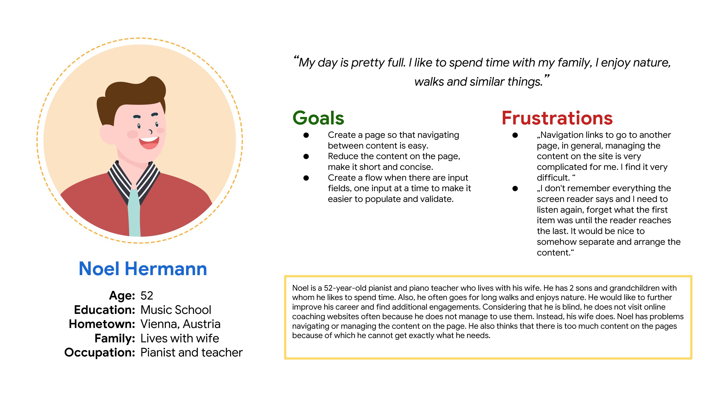
Persona
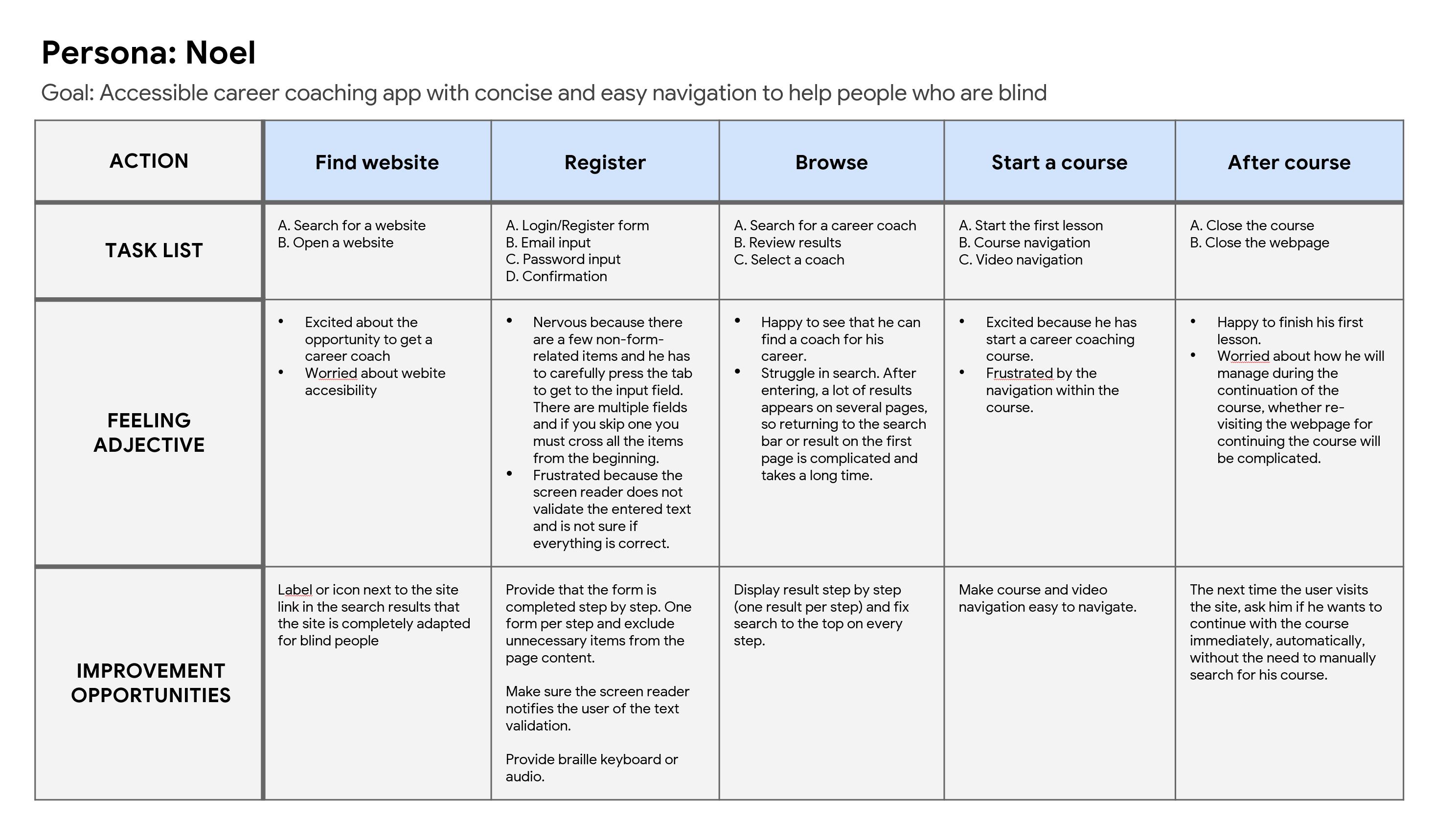
User journey map
Initial design concept
Based on the empathize and define phase I start with ideation phase.
After the competitive audit, crazy 8, goal statement, etc. I start sketches first for potential solutions for page contents, moving between pages and text entering. I sketched 8 potential solutions and then I took from the sketched solutions ones that I thought would best fit into the final solution.
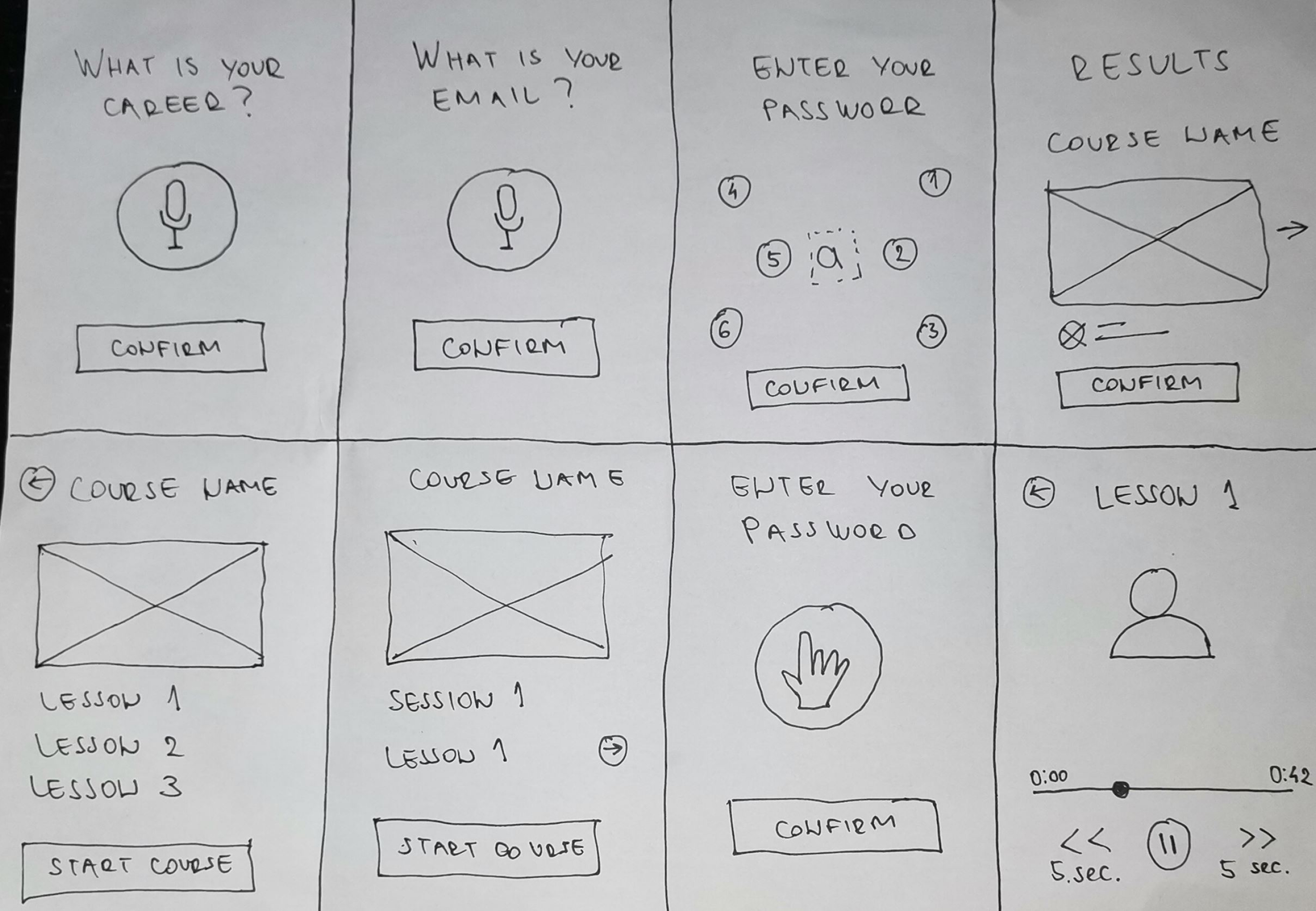
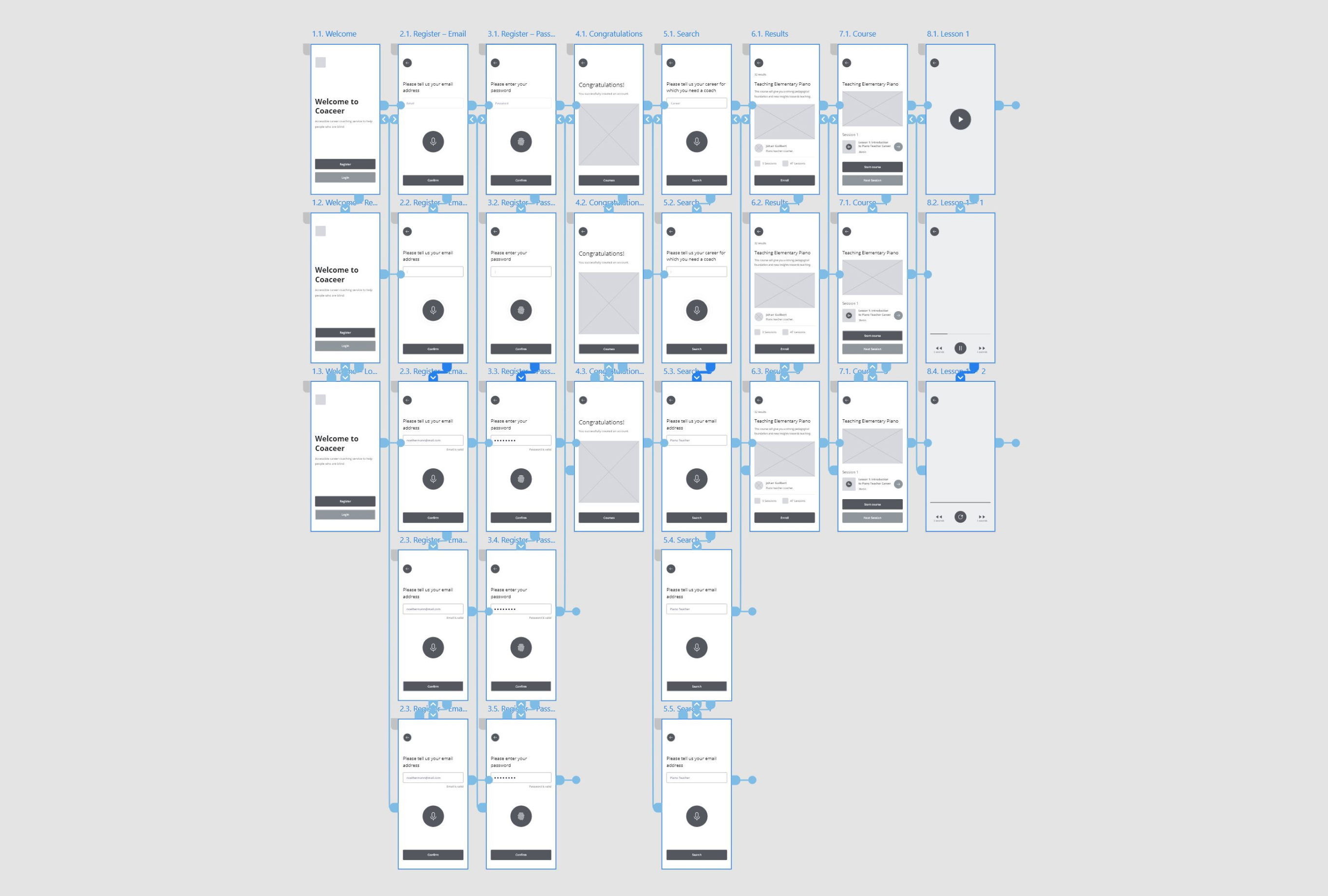
Peper wireframe
Digital Wireframe & Prototype
The next step is the digital wireframe. I transferred the idea to digital form, that is, I created a digital wireframe and a prototype. Considering that, study planning and prototype testing by participants began.
Research
I spent half the duration of this project interviewing people as well as doing some research on competitors. Here is a research study details:
Methodology
● Moderated usability study
● Location: Europe
● Date: Session will take place on August 22th
● Five participants, each completing the study on their
own. Two users are blind, one user is visual impairment, and
two users don’t have visual problems.
● All participants were selected to create an account, find,
choose and start a course inside of accessible career
coaching service app. Each participant complete
questionnaire on their experience privately.
● Each session will last 60 minutes and will include an
introduction, a short questionnaire, and a list of tasks.
Basic Questions
● How many times have you used the mobile or web app for
career coaching services or similar apps?
● How do you decide which app you use?
● How did you feel, what is your experience when using the
apps?
● What is your experience with the app interaction?
● Which way do you prefer for managing within the content of
the app?
User testing results
The specific group of users identified by the survey was blind people who used apps or websites only a few times. This group of users has struggled with navigation, screen reader, text inputs, and a lot of content. It is very important for them to provide clean navigation, only necessary content on the page, and an internal screen reader (inside the app). The general problem, for all participants, is text entering. They want an easy way as audio input or braille keyboard. They also need validation for input which the screen reader very rarely reads.
From the study and prototype testing by participants, I analyzed and synthesized the results, identifying patterns, themes, and I was able to identify pain points and define the insights they are as follows:
P0
My Courses page
Users need a page of their courses.
P1
Start next lesson
Clear way to start the next lesson.
P2
Search
Clear way to search for new course.
Mockup
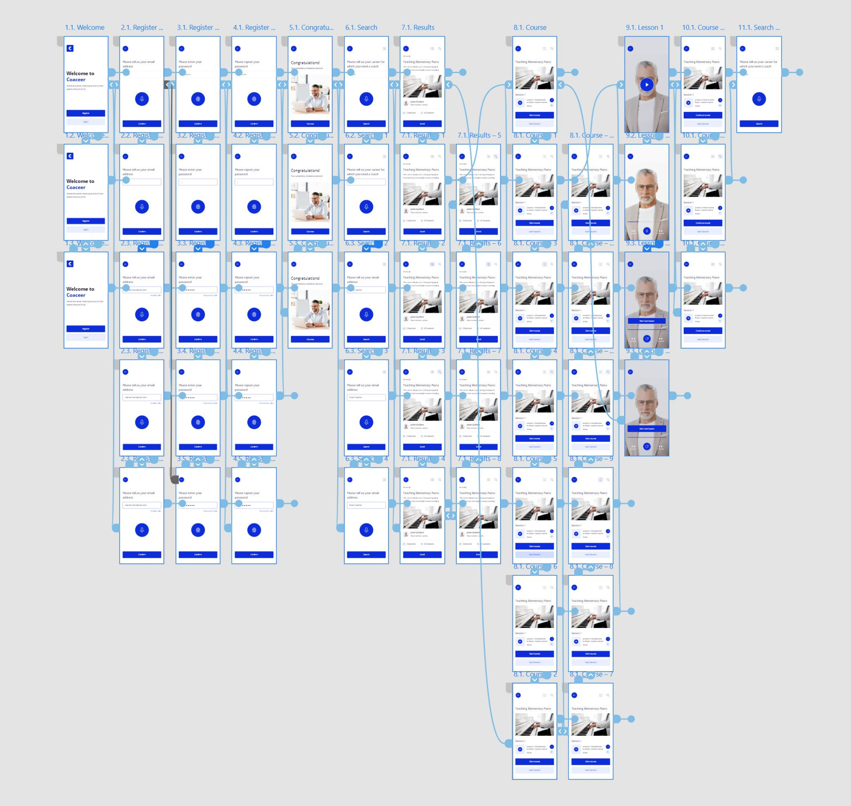
Based on the insight, wireframe is updated and finally, a high-fidelity design and mockup were created.
Next Steps
I would expand the app by adding new features and pages. After that conduct research one more time and include more people who are blind or have a visual impairment. Finally, conduct research on how successful the application is for blind people and whether they achieve the goal in terms of career improvement.
Perhaps the biggest challenge and experience came from trying to use some closed-eye apps with the help of a screen rider. I realized that many are not adapted for blind people, regardless of the screen reader, navigating through many apps was very difficult. I learned that even though the problem I was trying to solve was a big one, diligently going through each step of the design process and aligning with specific user needs helped me come up with solutions that were both feasible and useful.